OneHouse.ai
Dashboard and core user flows for an AI-driven data automation platform, designed during the company's stealth phase.
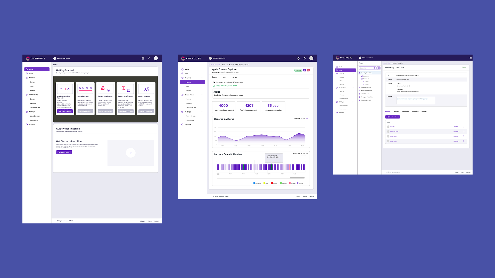
OneHouse.ai was building a new data-automation infrastructure product and needed a dashboard before the platform was public — there was no existing UI to react to, only a backlog of technical requirements and a stealth-mode team.
Discover
With no live product to audit, discovery meant working backward from the team's own mental model: how a data engineer thinks about pipelines, jobs, schemas, and lineage. I ran working sessions with the founding team to pull that model out of their heads and onto a whiteboard.
Define
I structured the information architecture around that domain model rather than around generic SaaS dashboard conventions — pipelines as the primary object, with status, lineage, and automation rules nested underneath instead of buried in settings.
Design
Wireframes first, to get the navigation and hierarchy agreed on cheaply, then a full high-fidelity dashboard design in Figma — organizing a genuinely dense technical surface into something a data engineer could navigate without a manual. The screens below are the shipped result.
The design gave OneHouse a coherent product to demo to early customers and investors well before engineering had production data flowing through the system.
The branded product — from first run to a self-tuning table
Four screens from the high-fidelity branded design: the guided first run, a live stream capture, and the two power tabs of a single table's detail view. Together they walk the platform's core promise — data flows in through a capture pipeline, lands in a lakehouse table, and the table then manages itself — with the "pipelines and tables as primary objects" architecture from the process above carried through every screen.
The home screen is a guided path
An empty data platform is an empty room, so the home screen sells the route instead: five sequential cards from linking a cloud provider to exploring the finished lake, with only the current step enabled — each stage unlocks the next. The dark tray isolates the wizard from the rest of the chrome, and the video rail beneath it acknowledges who's arriving: engineers evaluating a stealth product, one demo request away.
A pipeline that reports in plain language
The status tab answers an engineer's first questions in order: is it alive ("last sync 15 mins ago · next in 1 min"), is it healthy (alerts), and how is it performing (4,000 records and 35 seconds per commit). The payoff is the commit timeline at the bottom — every lakehouse event type gets a color (commits, savepoints, rollbacks, replaces, cleans, compactions), turning internals that normally live in log files into something you can read at a glance and hover for detail.
Lakehouse internals as swimlanes
Every table is a first-class object, reachable through the lake → database → table tree, with its identity card up top: S3 path, schema location, primary key. The Hudi tab renders the table's operational history as a swimlane timeline — save points, rollbacks, compactions, delta commits, cleans — so the open-source machinery underneath the product is inspectable rather than hidden. This is the screen that earned trust with engineers who already knew Hudi.
The product's pitch, as four toggles
OneHouse's core promise — a lakehouse that tunes itself — had to be a screen, not a slide. Each managed service (clustering, compaction, file sizing, cleaning) is one toggle paired with its receipts: 2.4 GB optimized, 2,450 file groups compacted, 328 GB of storage reclaimed. The insight banners above each block explain why the platform is recommending an action, so automation reads as a colleague's suggestion with evidence, not a black box flipping switches on your data.
Open to senior product design roles
Remote, US hours — full-time or contract. Happy to walk through the decisions behind any case study here.