Katin
Replaced a slow, bespoke storefront with a reusable e-commerce component library.
Katin's storefront had grown slow and hard to update — every new promotion meant a layout built from scratch, which meant every promotion shipped late. The fix wasn't a redesign; it was replacing bespoke pages with a library of named, versioned modules that the team could assemble, and that could survive a platform migration intact.
Discover & define
Brought on through an agency, I audited the existing site to find the actual bottleneck: it wasn't the visual design, it was the lack of any reusable structure underneath it. Auditing the recurring layouts across listing pages, product pages, and editorial produced the module inventory — heroes, product grids, buy boxes, accordions, video blocks, cross-sells, social-proof bands — that the new system would need to cover.
Build the system
Before any page, the foundations: a token-based design system in Figma — color cut to a navy/brick brand palette with one neutral ramp, a single responsive type scale, a CTA state matrix, product ribbons, and imagery rules. The full component sheet is below; every template in this case study is assembled only from what it defines.
Assemble the templates
The three storefront templates — collection listing, product detail, and the About page — were then composed from the library, with desktop and mobile designed as one deliverable per module rather than two parallel sites. The modules are deliberately content-agnostic: the same buy box, accordion, and cross-sell serve any product the merchandising team points them at.
Hand off & ship
Every module on the boards carries its own annotation — an ID, the device, and its status through the pipeline: design approved, transferred into the Nyla e-commerce platform, then direct-transferred to the live site. The annotations aren't decoration; they were the tracking system that let design, platform, and site stay in sync module by module.
The team could assemble new pages and promotions from existing parts instead of rebuilding layouts from scratch each time — and because every module had an ID and a pipeline status, the design-to-platform handoff was auditable rather than a folder of loose mockups.
Three templates, one library — with the pipeline on the page
Each board below is a full template shown as it was actually delivered: desktop and mobile side by side, assembled from named modules, with every section annotated — module ID, device, design status, Nyla platform transfer, and site transfer. Zoom in on any board and the component library's paper trail is right there in the margins.
The listing page as three modules
Hero, product grid, social-proof band — that's the whole template. The hero (module Hero 016) carries the seasonal story; the grid renders any collection the team feeds it; the Social Proof 012 band closes with the community. Desktop and mobile sit on one board because each module was designed as a single component with two layouts, not two designs — which is what let the mobile site stop being a maintenance afterthought.
A buy box that doesn't care what it's selling
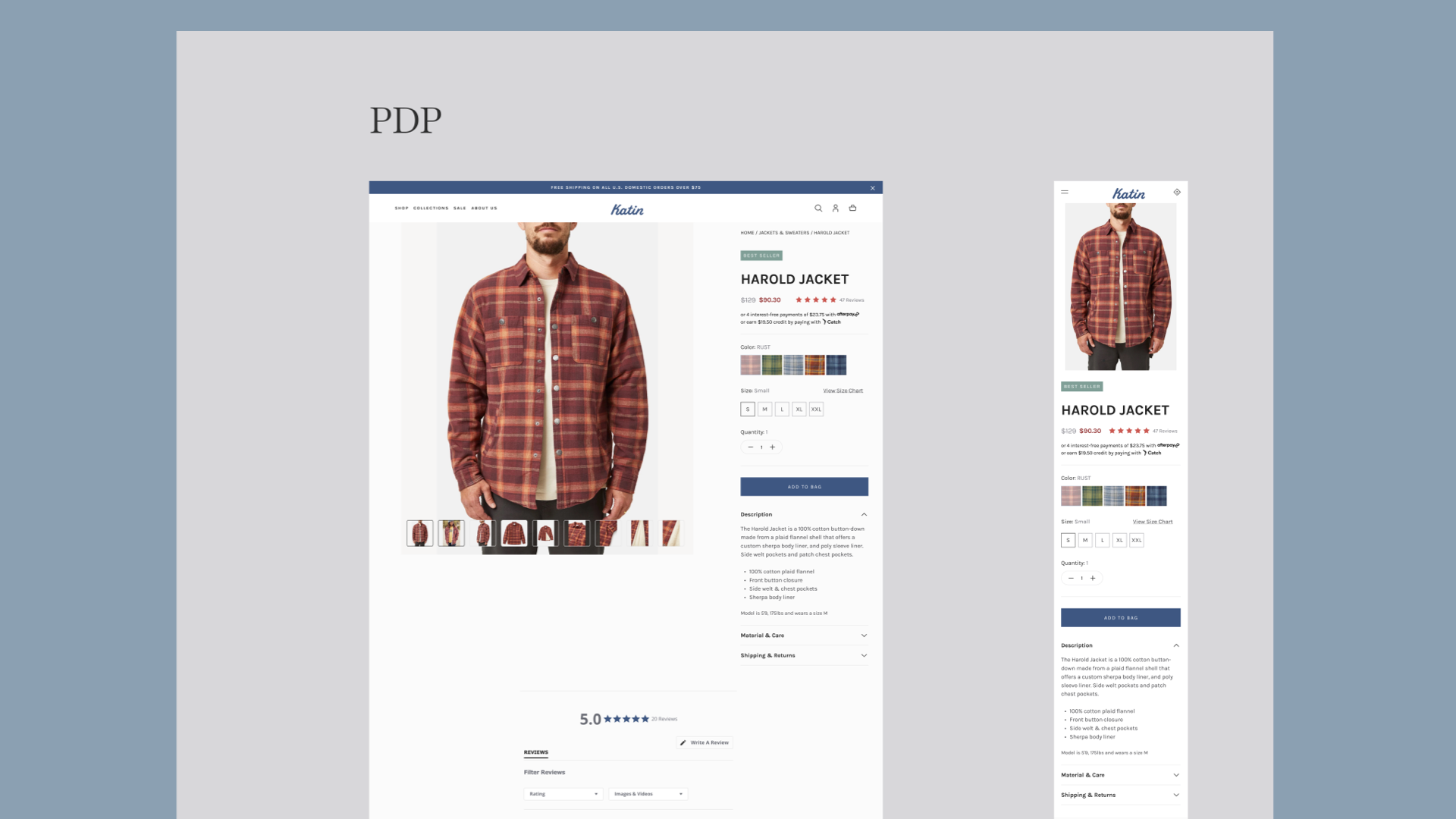
The PDP stacks five modules: the buy box, a story section (Columns 004), a Help & FAQ accordion (Accordion 002), a video feature (Video 007), and a cross-sell row (Cross Sell 002). Look closely and the buy box on a flannel photo reads "Lip Liner · 50mL" — deliberately. The demo content proves the point of the whole system: modules are content-agnostic, so the same template sells a sherpa-lined flannel or a skincare product without anyone redesigning a page.
Editorial from the same parts bin
The brand-story page is the stress test: if a component library can only build grids, editorial pages leak back into bespoke work. This one is composed entirely from the library — Hero 009, two text modules, Video 008, a three-up heading row, Columns 002, and the layered Image 009 — proving the team could publish campaign and story pages, not just commerce, without opening a blank Figma frame.
Preview shows the masthead and color foundations — click to open the full seven-section sheet
FOUNDATIONS · COMPONENT SYSTEM V2.0The sheet everything above is built from
The system behind the templates, reorganized onto a single spec sheet: 21 color tokens (brand, one ten-stop neutral ramp, status, backgrounds), one responsive type ramp covering both breakpoints per style, a CTA variant-by-state matrix, five product ribbons bound to tokens, logo and imagery rules, and the base-4 spacing and grid constants. Every module on the three boards above resolves to a value on this sheet — nothing on any template is a one-off.
Open to senior product design roles
Remote, US hours — full-time or contract. Happy to walk through the decisions behind any case study here.