FastDAR Design System
One system for FastDAR across the web, iPad, iOS and Android: tokens, components and a data table spec, built from the live brand at fastdar.com and shown on the lead alerts product.
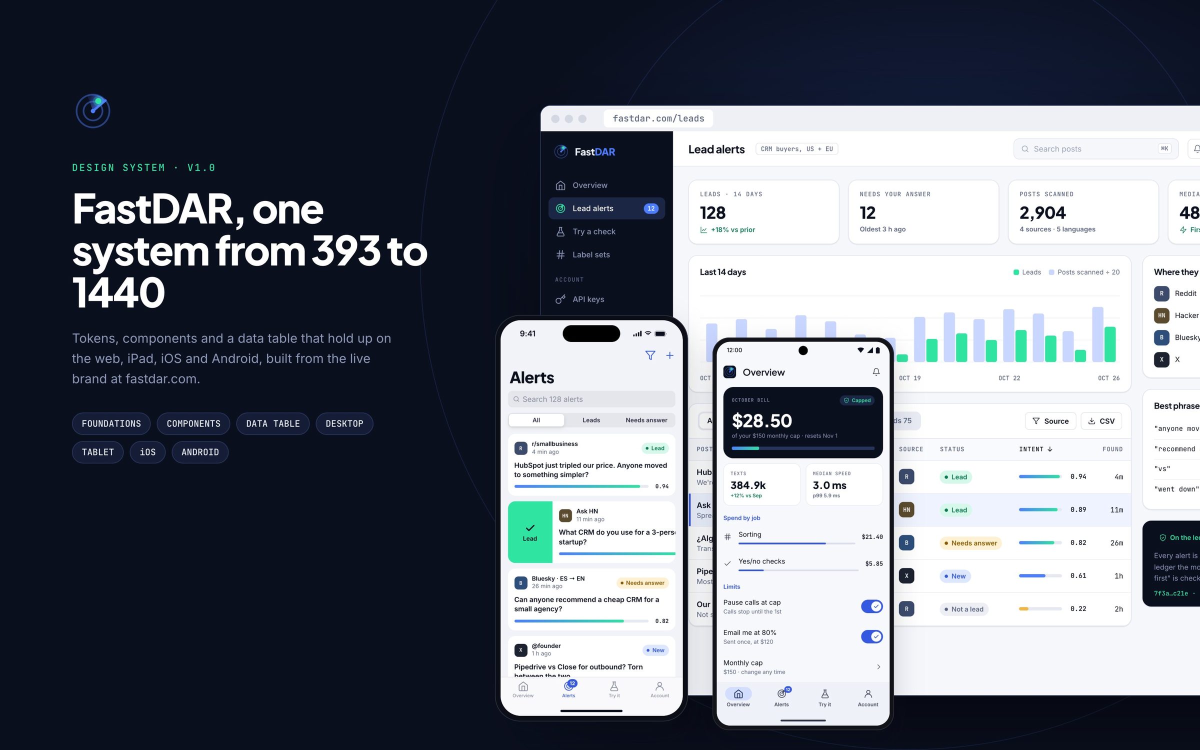
FastDAR started as a website and an account area. Lead alerts brought a second product with dense data, and it needed to work on a phone as well as a desk. This system makes one set of decisions and applies them everywhere, so a lead looks, scores and behaves the same on a 1440 desktop and a 393 iPhone.
Audit
The colors and type were pulled from the live site's CSS and brand file, not redrawn. Each color was checked for contrast, which split the palette into bright brand colors for fills and charts and darker text-safe versions for words.
Tokens
Color, type, spacing, radius, elevation and status roles are tokens in one file that loads into Figma as variables and into code as CSS variables, so a change to the text-safe blue lands in both places at once.
Components
Every part has its states drawn out, including the ones products usually skip: focus, disabled, loading, empty and a low-confidence score that is shown rather than hidden.
Platforms
The data table sets a column priority, and each platform gets the navigation its users already know: a sidebar on the web, a tab bar and sheets on iOS, Material 3 chips, FAB and bottom sheets on Android. The brand type carries across all of them.
Seven Figma boards, a tokens file, and screens for desktop, iPad, iPhone and Pixel. One-run Figma plugins turn the tokens into variables and styles, draw every board as editable frames, and rebuild the nine product screens as a native Figma file. Product screens use example searches and demo figures, not real customer data.
From tokens to four platforms
Seven boards: the foundations and components, the data table spec, then the lead alerts product on desktop, iPad, iOS and Android. Screens use example searches and demo figures.
Taken from the live brand, then made testable
Colors, type, spacing, radius, elevation and icons. Every color carries its measured contrast on the swatch, and the text-safe blue and green are split from the bright ones so the brand colors never fail as text. Red is left out on purpose: to a finance-minded buyer it reads as loss, so warnings use amber.
One set of parts, four platforms
Buttons in five states, fields with a warning state that explains itself, status pills, intent meters, cards, and the navigation pattern each platform expects: a sidebar on the web, a tab bar on iOS, and Material 3 chips, nav bar and FAB on Android.
A table that collapses on purpose
Lead alerts are a table first. The spec covers anatomy, loading, empty, corrected and low-confidence rows, and a column priority list that decides what survives at 1024, 834 and 393 wide, where rows become cards with swipe actions.
The whole week on one screen
KPIs, the 14-day trend and the alerts table share the screen with where leads came from and which phrases work. The month's spend against its cap stays pinned in the sidebar on every screen.
Same data, fewer columns
On iPad the table drops the source and select columns and the meter becomes a number. The lead detail explains its score in plain terms and keeps the draft reply, the timing and similar posts in one scroll.
Native patterns, FastDAR voice
Large titles, a segmented filter, swipe right to mark a lead, the detail as a page sheet with actions in thumb reach, and the bill against its cap at the top of Overview with inset grouped settings below.
The same flows in Material 3
A search bar and filter chips instead of a large title, an extended FAB for a new search, the lead as a modal bottom sheet with pill buttons, and M3 list items and switches for limits.
The same system, built natively in Figma
The boards above are drawn in code. A small Figma plugin rebuilds every screen inside Figma as native layers, so the file can be edited rather than traced: eight pages, nine product screens across four platforms, live text in Plus Jakarta Sans, Inter and JetBrains Mono, vector icons, and a 23-color variable collection the fills are bound to. These are renders of that file.
Desk and iPad, frame by frame
The 1440 dashboard and the two iPad screens as Figma frames. The main parts keep the names they have in the source (sidebar, card, pill, meter), and the frames are labelled the way they appear on the canvas.
Two phones, two sets of conventions
The same three flows on iPhone and Pixel. Paragraphs are real text that wraps at its block's width, so copy can be rewritten in the file and the layout holds.
Open to senior product design roles
Remote (US hours), hybrid or onsite — full-time or contract. Happy to walk through the decisions behind any case study here.