Campaign Fleet
An AI marketing service that writes a week of marketing for each product and checks every line against facts the customer has confirmed. Product design for a SaaS product now live at campaignfleet.com.
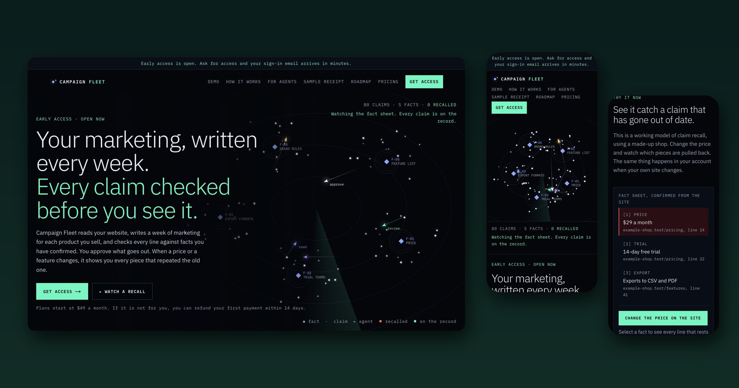
AI tools can write a week of marketing in minutes, which is exactly the problem: they can also invent a figure nobody measured, call a product “the fastest” when nobody timed it, and keep repeating an old price long after the website changed. For a small team, one wrong number in one email can cost a refund and a customer's trust. The design question was how to make AI-written marketing something a person can actually stand behind.
Discover
I mapped the ways AI-written marketing goes wrong for a small business: invented figures, unverified superlatives, and claims that quietly go out of date. The common thread was not the quality of the writing. It was that nobody could tell where a statement came from, or which pieces were affected when something changed.
Define
So the product is built around the confirmed fact, not the post. Every claim cites a fact confirmed from the customer's own site; a claim with no source is blocked rather than softened; and when a fact changes, every piece that repeated it is recalled. Approval and posting stay with a person. The AI drafts, but it never has the last word.
Design
I made the record visible everywhere: numbered sources inline in every draft, blocked lines shown rather than hidden, and recalled pieces stamped and paired with a corrected draft. The marketing site follows the same rule. Instead of describing recall, it runs a working demo on a made-up shop, so a visitor sees the product's central idea before reading a feature list.
Live at campaignfleet.com in early access, with plans from $49 a month and a first payment the customer can refund themselves within 14 days.
From the promise to a working recall
Six screens from the live site at campaignfleet.com, including the interactive demo before and after its one button is pressed.
The promise, drawn as a record
The headline states the deal in two lines: the writing is done for you, and nothing is shown to you unchecked. Beside it, the fact sheet is drawn as a live map, with facts as fixed points, claims orbiting them and agents moving between read, review and approve, under a running count of claims, facts and recalls. The visual argument is that the system keeps a record, not that it writes fast.
Show the refusal, not just the output
AI writing fills a page in seconds, but it can also invent a number nobody measured or call you “the fastest” when nobody timed it. So the example on this section is a checked post where two lines carry a numbered source and the third, a superlative, is marked no source: blocked. The product's value is the line it refuses to publish, so the page shows that line.
A working demo instead of a description
Recall is hard to explain and easy to show, so the landing page runs it on a made-up shop. On the left is the fact sheet, each fact confirmed from a line of the shop's own site. On the right are three published pieces, each citation numbered back to a fact. One button changes the price on the site.
Every piece that repeated the old price, pulled back
Press it and the fact updates, the two pieces that quoted $29 are stamped Recalled, and each gets a corrected draft queued for approval. The blog brief, which never mentioned the price, stays published. The demo makes the core design rule visible: a change to one fact reaches exactly the pieces that depended on it, and no others.
Control as a setting, not a promise
Each capability is described by what the customer sees rather than how the model works: proof behind every line, a warning when a fact changes, and approval the customer sets per product and channel, from approving every piece to letting a reviewer agent take routine ones. Five cases always come back to a person regardless, including the first piece on a new channel, anything marked as regulated and anything that spends money.
Priced by products, not seats
The unit that grows with the customer's work is the number of products being marketed, so that is what the plans count: Solo, Portfolio and Agency. Every feature is in every plan and teammates are unlimited, which keeps the comparison to one question. The terms sit in plain text under the cards: you can try it without risk and refund your first payment yourself within 14 days.
One responsive product on phone, tablet and desktop
Campaign Fleet's site and app are one responsive web product. These are live screens captured from campaignfleet.com and app.campaignfleet.com: in Safari's engine at iPhone 15 and iPad Pro 11 size, in Chrome at Pixel 7 size and on a 1440-pixel desktop, shown in iOS, Android, iPad and browser frames.
iOS
iPhone 15 · 390 × 844 pt · SafariThe radar plays first, even on a phone
The hero is the product working: facts as points, claims as lines, and a price that changes and pulls back the sixteen pieces that quoted it. On a phone it comes before the headline, so the first thing a visitor sees is the promise kept, then the words for it.
A working demo under one thumb
The recall demo stacks into one column: the fact sheet, each fact with the page and line it came from, then a full-width button to change the price. Press it and the posts below are recalled in place, so the demo works without leaving the page or zooming.
One field, no password
The app's sign-in is an email field and one button. The link arrives by email, so there is no password to type on a phone keyboard, and the note under the button says so before anyone wonders.
Android
Pixel 7 · 412 × 915 dp · ChromeSays who does each step
Every step names who does it: you, an AI model or fixed code. Only two of the eight involve a model, and the page says so near the top. At phone width the steps run as one numbered column.
Square cards, one per promise
Features are square-cornered sheets with a thin rule and a corner tick, like entries in a log. Each holds one promise and how it is kept, so a reader can stop after any card and still have the whole of that point.
Priced by product, read in a column
Plans are chosen by how many products you run, not by seats, and each plan stacks into a full-width card with its price in the mono figure style and its limits as a short list.
Tablet
iPad Pro 11 · 834 × 1194 pt · SafariThe radar gets the width
At tablet width the menu fits on one line and the radar takes the full width, with the headline and the green line that carries the promise directly under it.
Cause and effect on one screen
On a tablet the fact sheet and the posts that quote it fit on one screen, so a changed price and the pieces it recalls in red are visible together without scrolling between them.
Desktop
1440 × 900 · ChromeThe weekly loop, drawn as an orbit
On a wide screen the week is shown twice: as five written steps and as five points on one orbit, read, plan, draft, review and approve. The loop is the product, so the page draws it as one.
A long read, set like a document
How it works is meant to be read in full, so it runs as one measured column with each step's owner in mono under its title. The light headline weight keeps a long page calm.
How I built Campaign Fleet from its design system
As the product designer I made one rule carry the whole look: colour means a state, never decoration. Everything else stays cold, dark and square so the states are what you notice. I then wrote the system down from the live stylesheet, with a script reading the values out of the CSS, so the site, the app and the emails all come from one set of decisions.
Make colour a state
Green for what is on the record, red for what was recalled, amber for the step waiting on a person, muted for retired. Nothing else gets those hues, and the green action button shares the green of a proven claim.
Set records in mono
Claims, sources, labels and figures are IBM Plex Mono, so anything a reader might check against a source looks checkable. Reading text is Plex Sans, with light headlines rather than bold ones.
Keep it square
Every sheet, field, button and chip has square corners, like a ledger. Only the dots on the radar are round, which makes the radar the one soft thing on the page.
One system, three surfaces
The marketing site, the signed-in app and the emails share the tokens, so signing in does not change the look. The phone, tablet and desktop screens above are that one system.
Red means recalled, and says so
The recall state is five tokens: the red, its dark wash, the green it is set against, the mono stamp style and square corners. They make the stamp and the recalled line, and the live demo shows both the moment a price changes. The word “Recalled” is always there, so the state never depends on telling red from green.
Four states, three variables
Every fact, draft and post is waiting, on the record, recalled or retired. In Figma each state is a mode of the same three variables (text, fill and edge), so a designer sets a frame's mode and its chip, background and edge all change together. Every state also carries its word, and recalled lines are struck through, so the state never depends on telling red from green.
Named for what they do
Chrome variables are named by role and point to primitives named by value. The green that marks a confirmed fact is also the only filled button, so the one action on a page and the proof behind it share a colour.
Light headlines, mono records
Eleven text styles. Headlines are light rather than bold, which keeps a page about trust from shouting. Mono marks anything a reader might check against a source, and nothing is set under 14px.
Measured before it was handed over
Every text pair passes, the lowest at 6.4:1 (red on its own wash). Building the tokens also showed two colours written as literals in the CSS rather than as variables, the control border and the lead-text frost; they are primitives in Figma so the file and the code can be brought back into step.
Two colours outside the system
Reading the CSS turned up two values written as raw hex instead of tokens: the outline button border and the lead-paragraph text colour. I added them as named colours so the file matches the product, and flagged them to become proper CSS variables so the two can’t drift.
In Figma and in Claude Design
A Figma kit of layered boards with the tokens as variables, with each record state as a mode, plus a plugin that rebuilds the live pages as editable layers. The same system is set up in Claude Design, so an AI agent building for Campaign Fleet starts from the real rules.
Open to senior product design roles
Remote (US hours), hybrid or onsite — full-time or contract. Happy to walk through the decisions behind any case study here.